Happy Halloween, everyone! I thought I would bring you behind the curtain on all of the Babadook related things I’ve been doing lately. If you haven’t heard of new horror film The Babadook, you will soon enough. It’s the big buzz horror film this year, winning Best Horror feature at Fantasia Fest and it truly is worthy of the hype. The concept is simple but the scares are anything but conventional. Here’s the trailer to get you started. It’s available now on DirectTV and opens in theaters on November 28.
The film is a beautifully shot, sinister, psychological horror film with incredible performances by Essie Davis, child star Daniel Henshaw and a terrifying new cinematic boogeyman. After viewing the screener IFC sent back in August, I was drunk on inspiration.
And so we begin the process of creating the U.S. one sheets for IFC Midnight. Along the way, I had the opportunity to create a poster for Mondo and an unused concept which now graces the latest issue of Rue Morgue for their cover story on the film but more on that a little later.
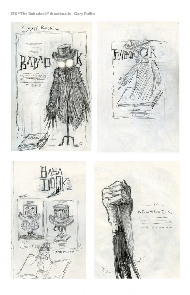
We’ll start with some initial concept sketches. These are only a few examples culled from a pile of doodles. Just me drawing in the dark, brainstorming while the film flickers in front of me.
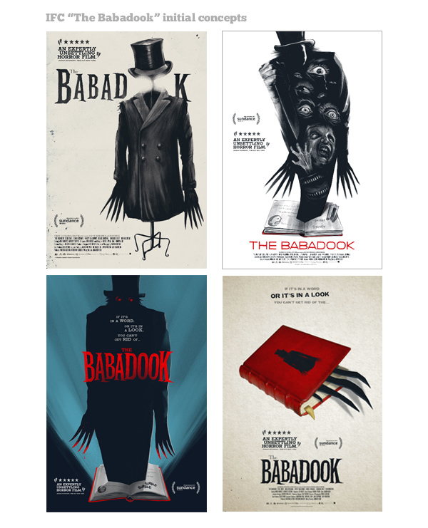
I then move onto the computer and start to bring the concepts to a more visually digestible state. I spent a little extra time on these “roughs” as I normally do. I wanted to show IFC and director Jennifer Kent some solid directions. Below are a few more explorations, keeping in mind some of IFC’s initial notes.
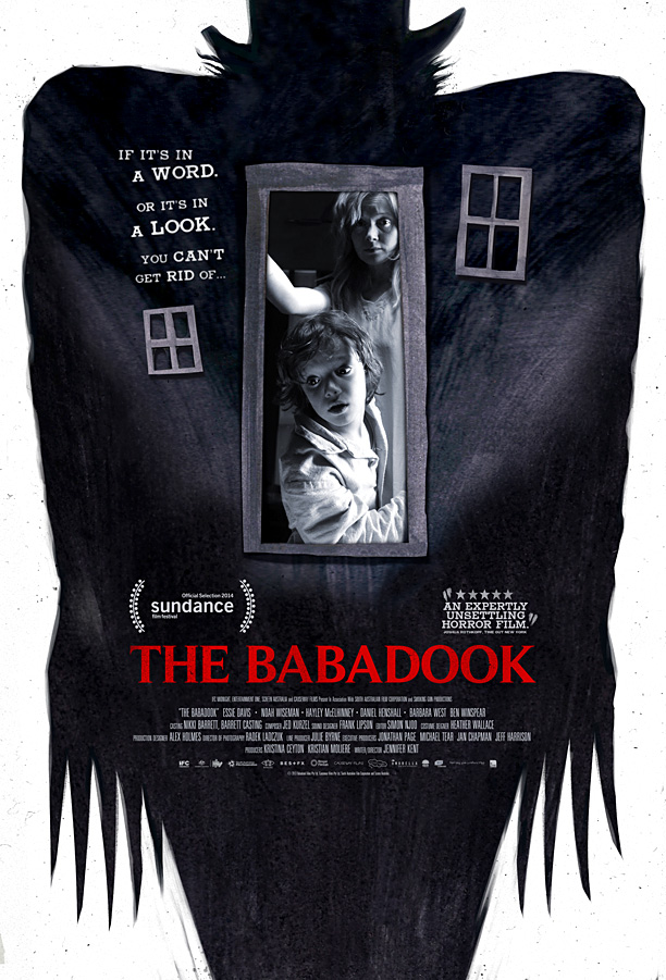
After some feedback from IFC and director Jennifer Kent, it was decided that we should use specific photography of the actors and fonts from the film’s past posters. I was happy to oblige. After a few rounds of tweaks, here is the official U.S. one-sheet for The Babadook. There’s a second poster, yet to be revealed.
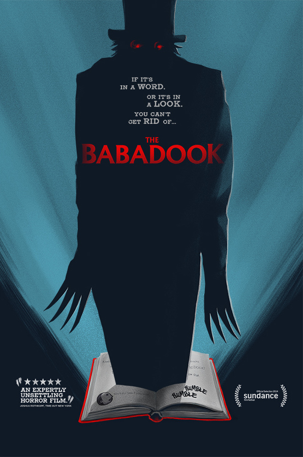
The concept below was used for its premiere on Direct TV.
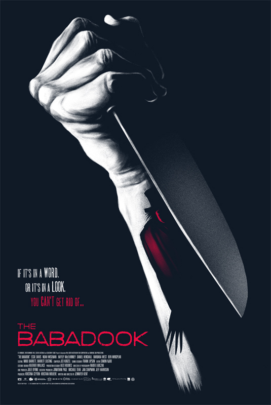
When the opportunity reared its head to create a design for Mondo, I threw my top hat into the ring and showed them some unused concepts. Mondo art director Rob Jones suggested we go with the striking and simple image of the knife. For me, the image of a knife really speaks to the psychological terror in the film. A knife doesn’t always have to say “slasher movie”. It’s also a visual devise to convey the psychological horror of a person frayed at their wits end. Pushed to grab a knife in defence of the Babadook, we watch the character of Amelia come unhinged as he, or “it”, drives her to insanity. Always in shadow, always present, the Babadook lurks from behind the blade of the knife. This poster was released at MondoCon and recentlysold out on Mondo’s site, but I’ll have more copies available in my store shortly.
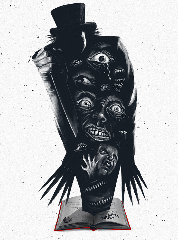
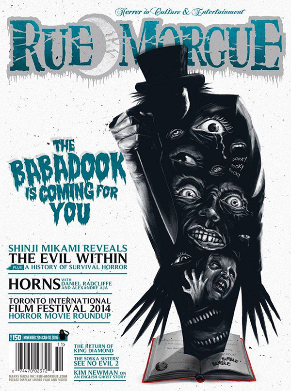
Rue Morgue Magazine heard I was developing key art for The Babadook and asked IFC and I if they could publish an unused concept for the film. This particular concept was one of my favourites of the bunch, so I was very excited it found a home on the cover of my favourite horror magazine. The slick cover design is courtesy of RM art director Andrew Wright. The issue hits stands and digital on November 1st.
I hope this sheds a little insight behind the artwork for the film and I hope you all catch it in theaters or VOD when it comes out. All bias aside, it’s my must see horror film of the year. And keep a night light on after viewing, you’re going to need it.
Have a safe and very happy Halloween!
Gary
